Timeline: 6 MonthsMy role
As the leading designer for this initiative, I collaborate closely with the Product Manager and a team of 5 engineers. My role is to steer the design direction, strategy and enhance the user experience across the Dojo's Business App.
Background
Merchants deal with huge friction managing their finances, typically using at least four different software solutions to do so.
For example, one software for payments, another for banking, another for table bookings, etc. This means constantly monitoring different platforms, managing multiple log in details, interacting with different interfaces, accessing support in different ways and so on. This is not only time consuming and inconvenient for the merchant, but costly as well.
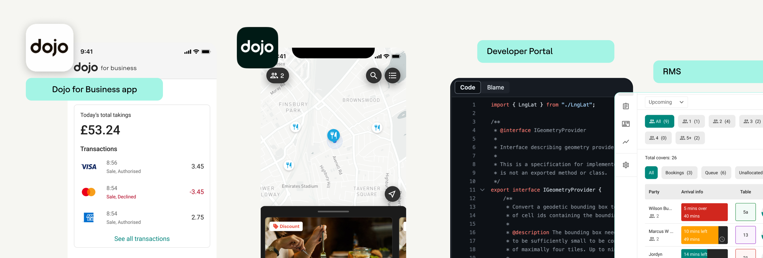
Dojo provides a comprehensive suite of products designed for SMEs and enterprise businesses to efficiently operate and expand. Their offerings include payment solutions, a restaurant management system, business funding, a consumer app, and an upcoming loyalty solution.
Context
The evolution of the Dojo for business app has been a fascinating journey, marked by organic growth that has introduced a myriad of new product functionalities and features. While this dynamic expansion has undeniably enriched the user experience, a notable absence of a clear overarching purpose has inadvertently resulted in a somewhat fragmented journey for customers.
This lack of a guiding principle has not only created challenges in seamlessly navigating through the app but has also created challenges in internal decision-making processes.

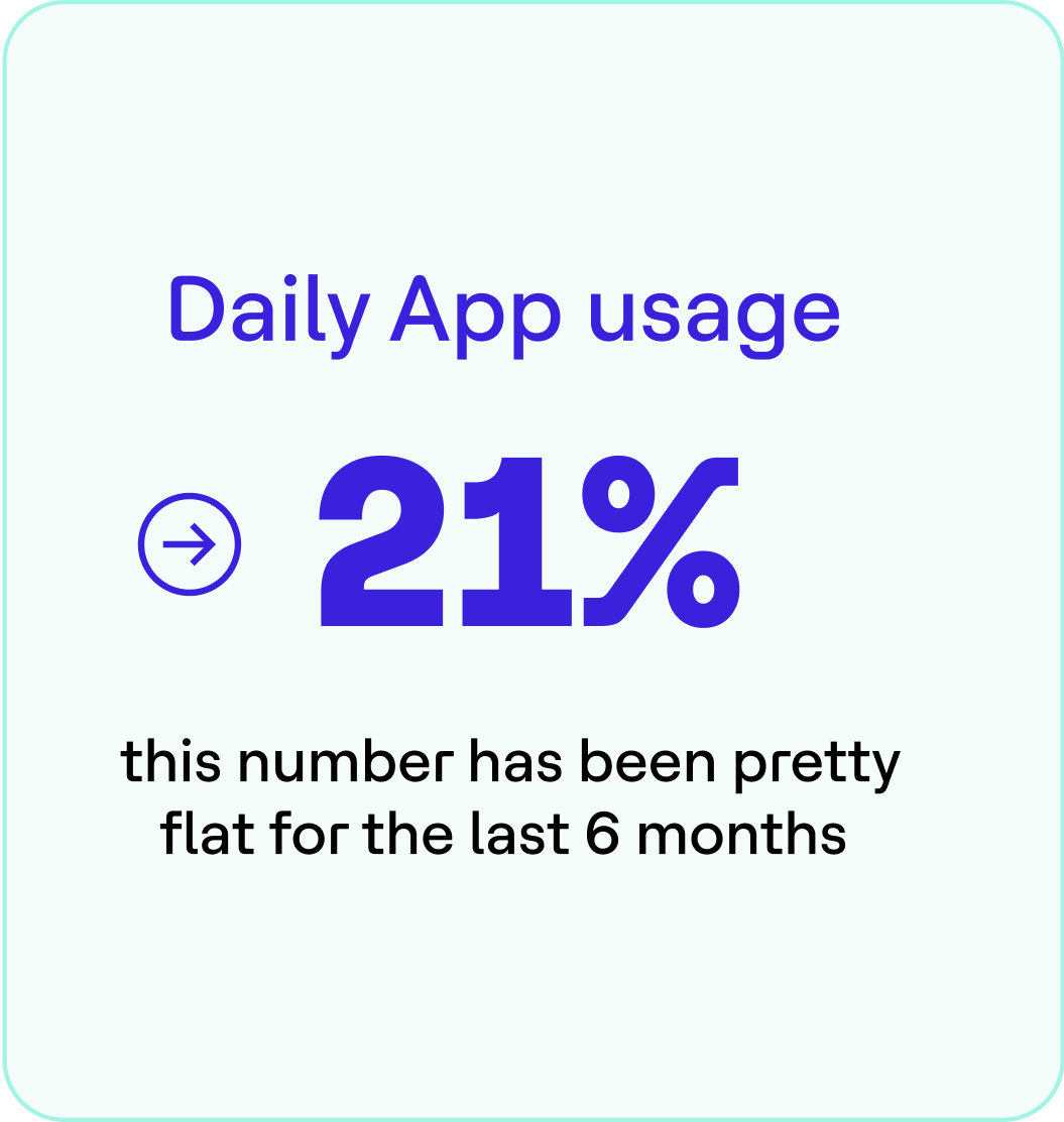
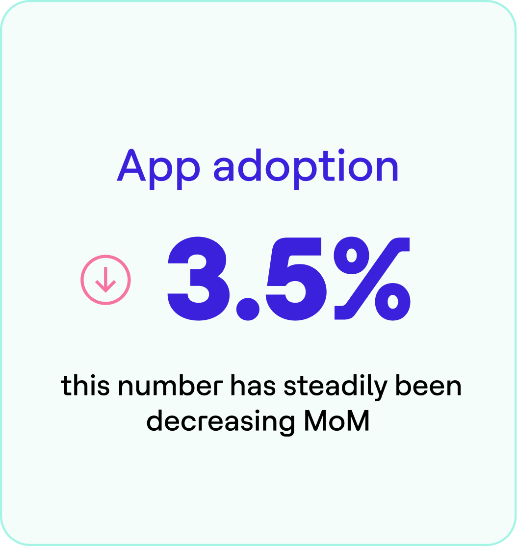
Upon reviewing user research data, it is evident that many of the app's features are not being fully utilized by customers. This presents a significant opportunity to enhance engagement by prompting users to explore and leverage the app's wide array of capabilities. By increasing awareness and guiding users to discover the untapped potential of the app's diverse features, we can greatly improve user engagement and maximise the app's value for customers.
How does this manifest in the UX on the Dojo for Business App?


Business goal
So business owners don’t have to deal with the hassle of managing multiple software solutions from different service providers.
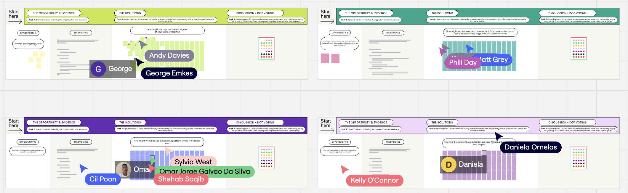
We kicked off the Project quite unconventionally with a 3-week Design Sprint, focussing mainly on establishing a robust foundation for our app, prioritising the fundamental elements that form the cornerstone of its functionality and overall structure.

Based on user interviews, past research, and historical data from various user groups gathered through desk research and field studies, we identified the core jobs to be done that will support us in establishing our foundation.


Crafting the information architecture map
I started by mapping out the current information architecture . Given the substantial overlap between products, this exercise helped me and the team understand which areas would make sense to unify in the new app structure to provide a better unified experience to merchants

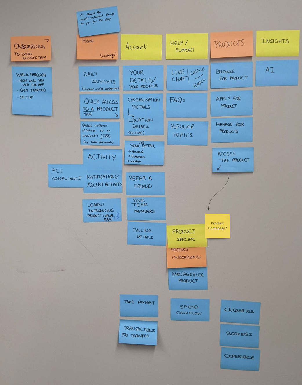
To better understand how to organize the new information architecture (IA), I conducted additional user research using tree testing. This method helps us see how users naturally group information by having them navigate a simplified version of the site's structure. By watching how they interact with different categories and groupings, we can pinpoint areas that might be confusing or inefficient. These insights are crucial for refining the IA to make it more intuitive and user-friendly, ultimately improving the overall user experience.

What is the market doing?

Additionally to user research, I organised a product teardown session to draw inspiration from other brands and enhance our own product direction. We carefully took apart several top products in our industry, looking at everything from their user interfaces to their features.
In order to address the central design challenge of navigation, the PDE team and I run a product teardown session to get inspiration from navigation patterns of 18+ apps, including super apps from non-financial industries like travel and music.
This deep dive into diverse design approaches allowed us to gather valuable insights and best practices that could be adapted to our own context. As Dojo continues to grow, it's crucial to maintain a high level of design quality in the experiences we create. By analyzing how leading apps handle navigation, we were able to identify key principles and innovative solutions that will help us achieve this goal. This process laid a solid foundation for establishing strong design principles for the App Vision project to:
A: Increased awareness amongst our Peers
B: have a shared language for design critique and update sessions

What does the end-to-end flow look like…
…and what questions do customers typically have throughout the experience?

Through story mapping, we visualized the entire user journey and how different features and navigation elements interact across different scenarios. This holistic approach allowed us to see the big picture and understand the relationships between various user actions and touchpoints.

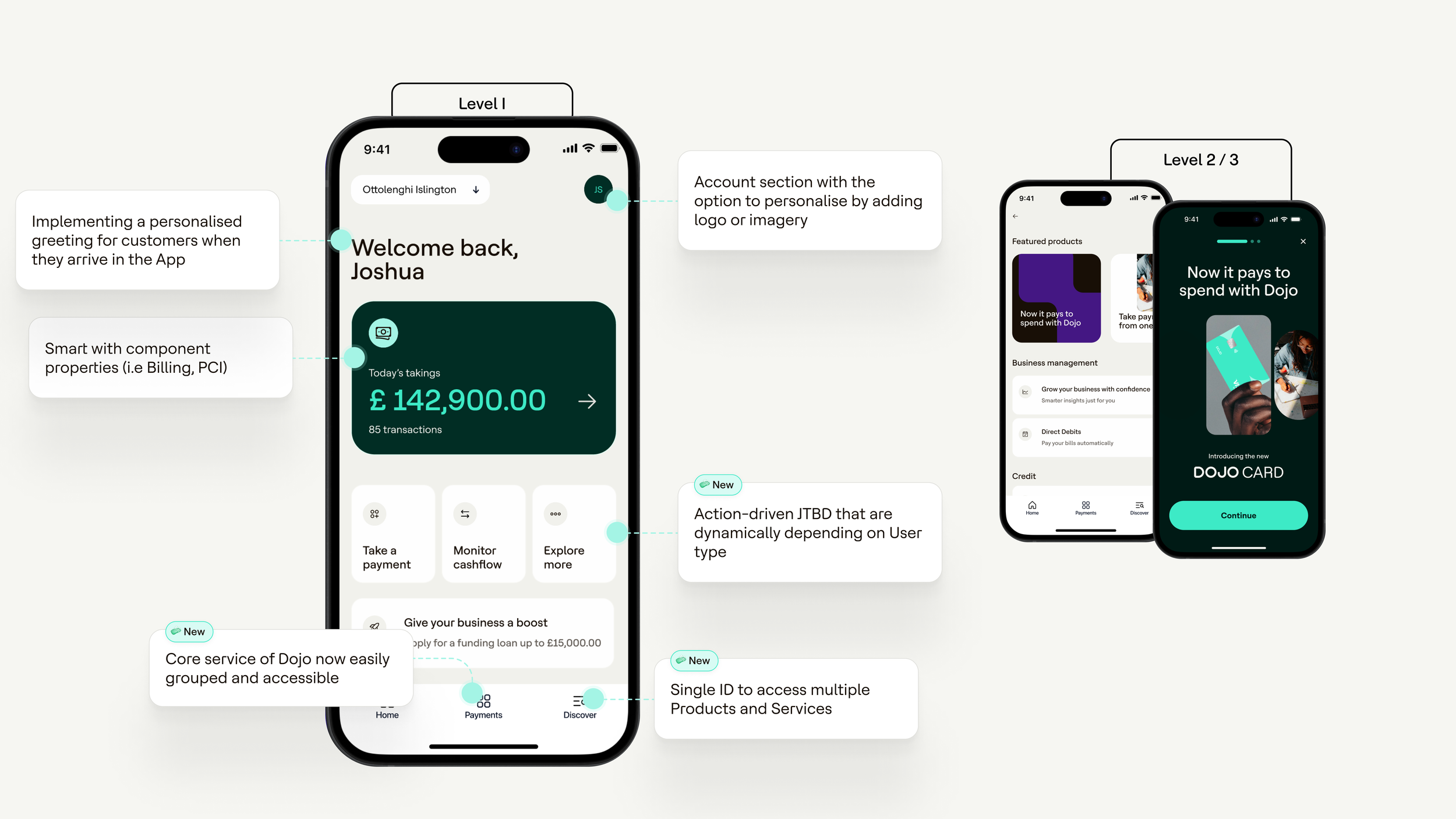
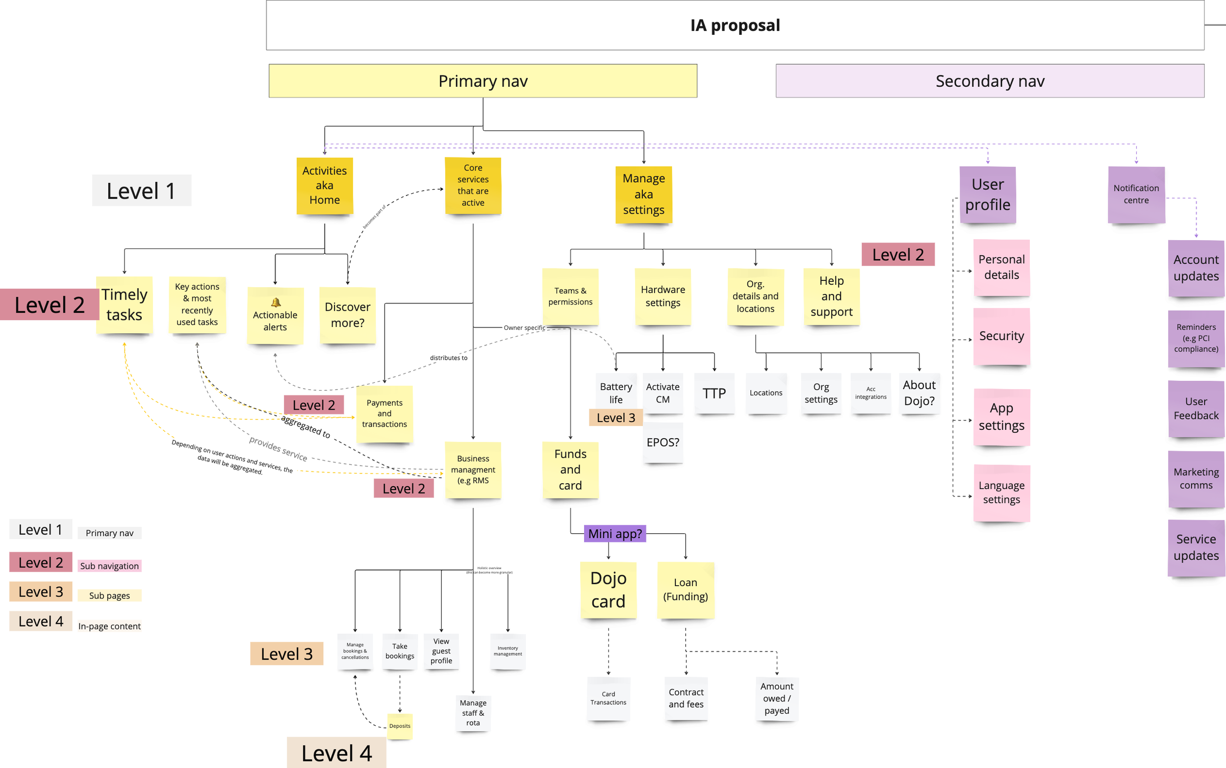
Proposed new information architecture
The primary navigation is designed to be scalable, accommodating and facilitating up to four entry points for navigation. With subcategories focusing on customers JTBD


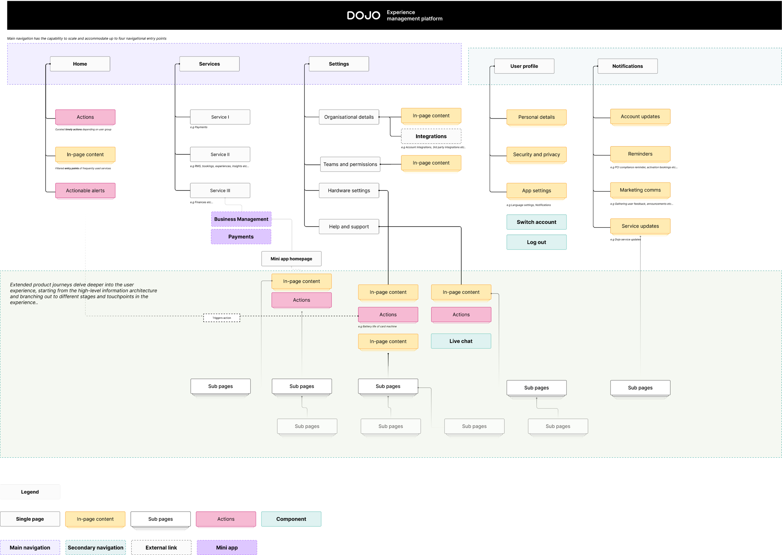
To optimise our navigation, I propose incorporating two touch points in the header and three in the tab bar, streamlining user interactions, enhancing accessibility and removing complexity to navigate to key features
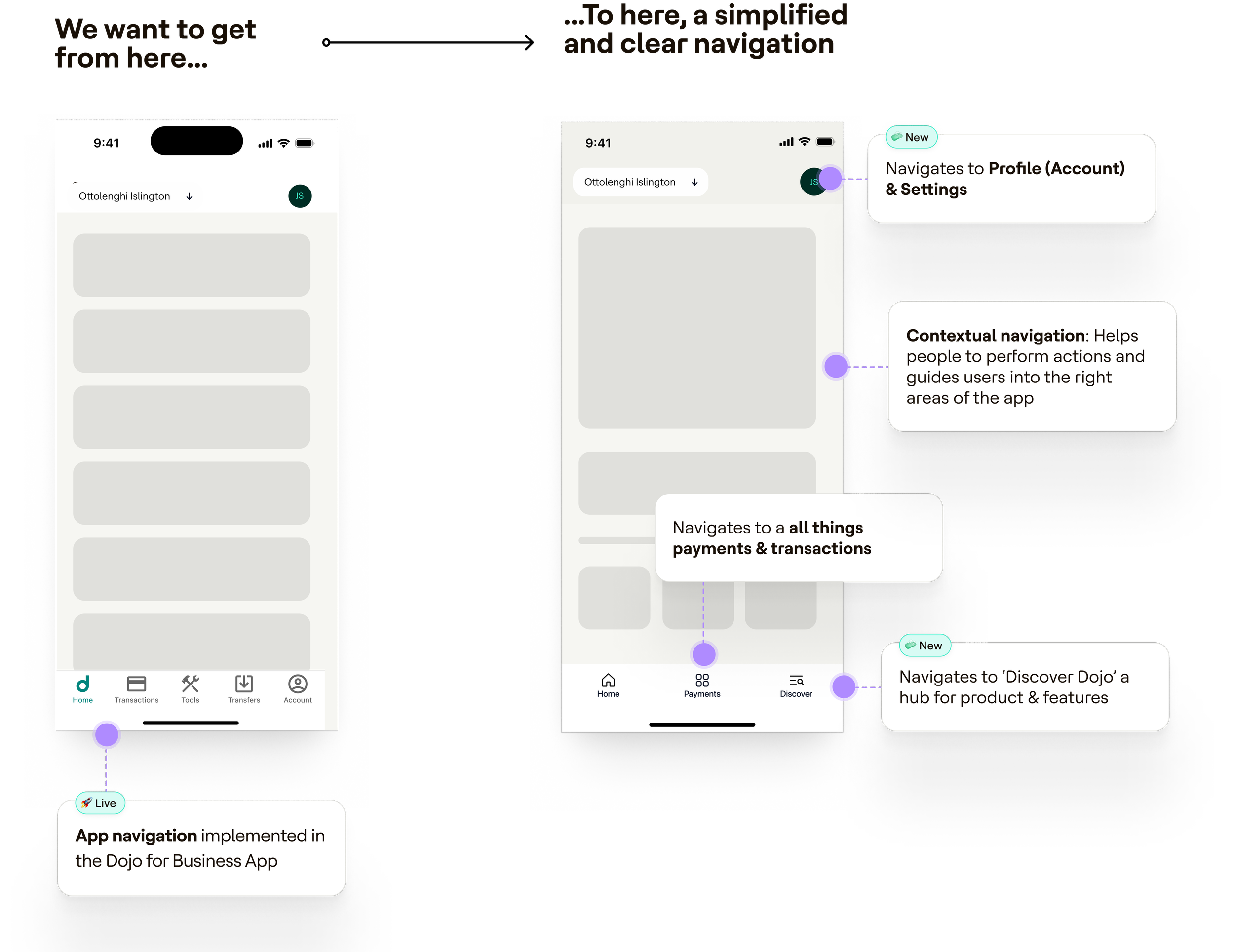
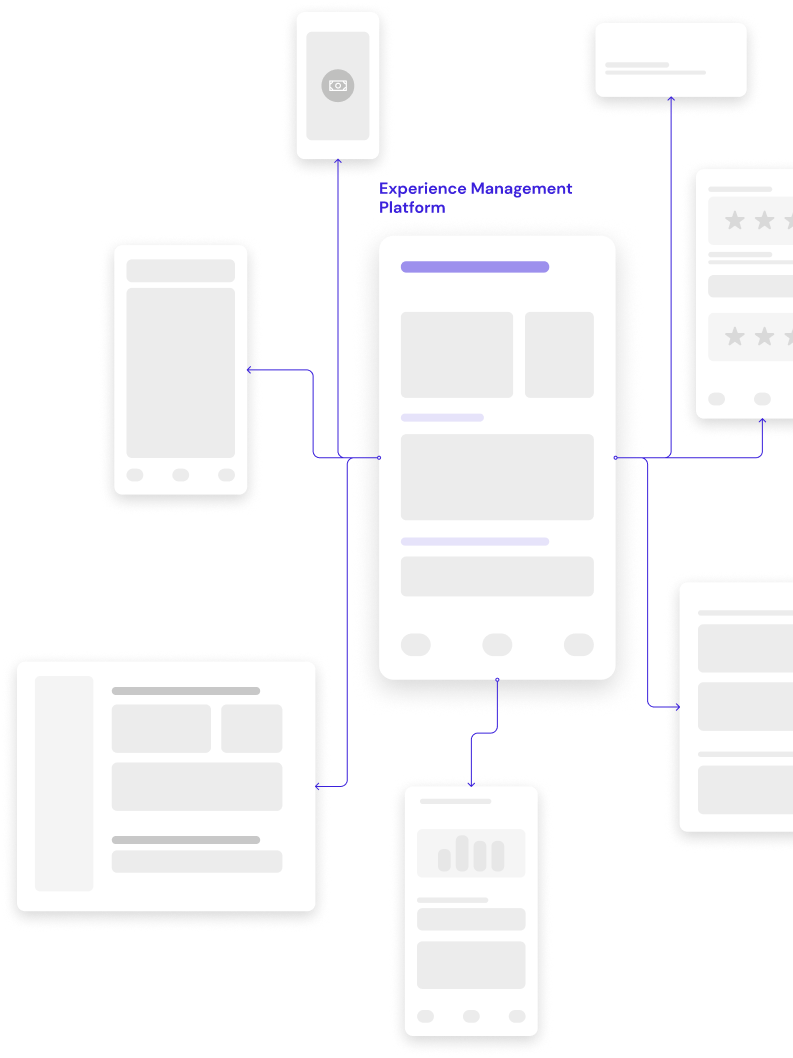
Personalised interconnected Experience Management Platform

After another round of user tests we settled on this approach, I began the process of translating this into high fidelity designs. Given our larger rebranding strategy, it was crucial to collaborate closely with the App Platform team to establish scalable and unified components.